Page 2 of 9
Re: How to understand the graph
Posted: Fri Dec 14, 2018 9:07 am
by James
The white graph was created using the online charts at
https://MuseMonitor.com/Chart.php
Simply record a session with Muse Monitor in CSV format (the default) and open it in the online chart viewer. Once it's displayed, you'll see a button the says "Right Click this link to Save As PNG Image".
The black one right at the top was created by pressing the share button in Muse Monitor itself.
Re: How to understand the graph
Posted: Fri Mar 01, 2019 9:39 am
by Hagen
carbophoze wrote: ↑Thu Sep 28, 2017 9:29 am
I recorded the hour-long data and want to interpret the result correctly. Help me please.
How do I know in what state my brain was?
What is the theoretically ideal graph for the alpha state?
Thank you.
- 28_morning.png (88.42 KiB) Viewed 23846 times
csv format
https://drive.google.com/open?id=0B3ZRC ... mNNaUgtdm8
I have two similar questions.
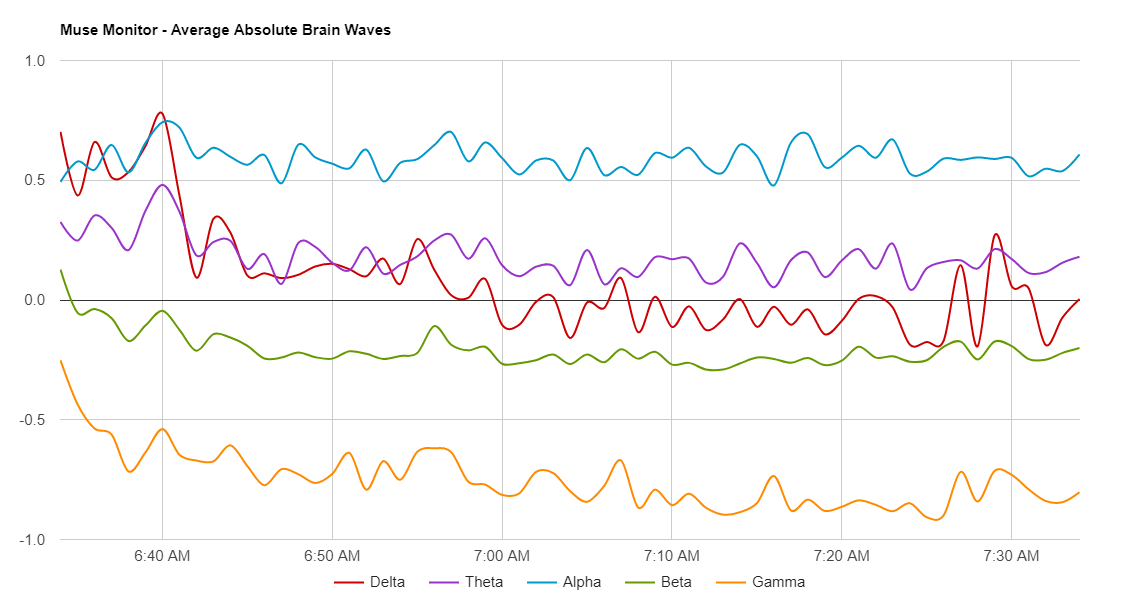
1. Regarding this graph, just to make sure that I got it right: The graph shows the
average absolute brain waves. According to the graph Alpha waves have been the most dominant brain waves on average, whereas the "amount" of Gamma waves was the lowest (compared to all other brain waves measured). Is that the right interpretation?
Reason for my question: I am looking for a way to measure my 'progress' during meditation. 'Progress' means that the relative amount of Theta and Delta waves in my brain (compared to all other brain waves) increases, such that I am more in a 'Theta/Delta state' during meditation.
2. Regarding the graph view
'Absolute' in the Muse Monitor App: The brain waves are measured in dB units. Why dB?
Sorry, I am no expert. Maybe some questions are a little bit foolish. Anyway I would very much appreciate an answer and explanation

Re: How to understand the graph
Posted: Fri Mar 01, 2019 11:00 am
by James
1. "Average" is referring to the average between the four sensors taken over the time period. The higher the line, the more of that wave was present, so yes in the above graph Alpha was dominant.
2. dB are used as the value is derived from a logarithm. The units really don't matter as you're only ever comparing the waves values relative to one another.
Re: How to understand the graph
Posted: Sat Mar 02, 2019 11:02 am
by Hagen
Thx James for the explanation.
One more thing: I did a meditation and created the average absolute brain waves graph. How can the values on the y-axis be explained/interpreted? According to my graph all brain waves are (mostly) in the range of +40 to +50 points. Is that a good thing? For example: What would a value of +90 mean compared to a value of -90?
Moreover all brain wave types are very close to one another throughout the whole meditation. Is that a 'typical' result?
Re: How to understand the graph
Posted: Sat Mar 02, 2019 5:39 pm
by James
These waves are all quite close. I think you can do better if that's what you're asking

Re: How to understand the graph
Posted: Sun Mar 03, 2019 6:30 am
by Hagen
Hey James,
honestly, I am truly wondering if my Muse is working correctly. In contrast to meditations, I now did numerous sessions using the Muse in waking state doing (mathematical) calculations in my mind, thinking about different things. I tried to sit still, having as little facial movement as possible to make sure that the sensors are working correctly. However, my results always look like the following graph attached. And this is very weird. I read lots of literature, but high proportions of delta waves in waking state and relative litte proportion of beta are very, very uncommon. Actually the very opposite (i.e. high proportion of beta und low delta) is expected in waking state.
Any explanation for this?
Re: How to understand the graph
Posted: Sun Mar 03, 2019 1:13 pm
by James
This looks normal for non-meditation to me.
Re: How to understand the graph
Posted: Sun Mar 03, 2019 2:14 pm
by Hagen
But in non-meditation Beta waves should be dominant by by far, whereas Delta, Theta and Gamma are almost not existent. This issue can be found in every literature. But my results are the very opposite which makes me very sceptical about the accuracy of my Muse.
Can anyone else share his/her results in awakened state?
Any other explanations?
Re: How to understand the graph
Posted: Sun Mar 03, 2019 2:49 pm
by James
In your meditation session above your Beta looks like it's around 45 where as in the second non-meditation it's up around 60, so that's way more "awake". Yes, the others are up too, but each wave doesn't just do one thing.
In my experience "normal" non-meditation graphs are a big jumble of high psd waves, where as with meditation they settle down to be much lower and separate out just as above.
Re: How to understand the graph
Posted: Mon Mar 25, 2019 1:51 pm
by meditador
how interesting this thread What does the Y axis mean? What is the unit of measurement?